Pareto Analysis Chart Template
Pareto Analysis Chart Template for Excel
What is a Pareto Chart?
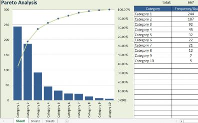
A Pareto chart is a specific type of bar chart that has values that are ordered beginning with the largest to the smallest, and a line graph that superimposes the data to show the cumulative total. In the line graph of the free excel templates, there is a secondary axis which is located in the right part of the chart with values that start from 0% to 100%. When performing a Pareto Analysis in the free excel templates, you need to simply look at the place where the line crosses the 80% on the graph. On the left side, you will see the categories that are the most important factors.
In these excel spreadsheet templates, you will automatically create a Pareto chart when you place different factors to perform a Pareto analysis to place the most important defects, causes or issues. The values you place on the chart templates can be defect sales numbers, counts, e.t.c.
Features of a Pareto Analysis template
Sorting Values in Descending Order in the Chart Templates
The worksheet of the Pareto analysis template does not sort data from the largest to the smallest, but the Pareto analysis template excel is prepared in a way that it makes it easier for you to perform the sorting function. You will have to select the whole range of the Causes & Defects together with the labels of the column and checkout Data->Sort to arrange the data into descending order.
Adding and Deleting Categories in the Microsoft Excel Templates
In the Pareto analysis template excel, you will find formulas that have been placed in the data entry table below the chart for it to be easy to delete, insert, and copy rows without the need of altering the formulas. You have to insert the rows. When inserting the rows, you need to do that above the last line or below the first line in the table for the references to expand for the inclusion of the rows that have been added in the excel chart templates.
Label Changing
The chart’s x-axis and y-axis labels are linked with the headers of the column in the table that is located below the chart. For instance, you may desire to make changes to the headers of the columns to something different from what is present on the chart.
Unique Features of the Pareto Chart Template
Labels of readable categories: you will find labels for the categories aligned over the top of the bars to have fairly descriptive category names so that you can have an easy time to interpret the chart.
Select your own cumulative % cut-off: you can choose another cut-off and not the usual 80% cut-off.
Highlighted bars: the “vital few” bars are highlighted in different colors compared to the “useful many” which make it easy to notice the key factors.
Pareto Analysis
When studying statistics, you learn the Pareto principle. This rule is also known as the 80-20 rule, and is an established but general guideline that indicates that 80% of the results come from 20% of the effort. This was first observed by Vilfredo Pareto in Italy where 80% of the land was only owned by 20% of the people. In the 20th Century, Dr. Joseph M. Juran first used the principle in quality management and he rephrased it to “ the important few and the useful plenty” as a description of the 80-20 rule. The numbers are not usually static as they change from time to time.
When you should use Pareto Chart Excel Spreadsheet Templates
- When you are performing an analysis on several factors
- When you want to deal with others about the data
- When you want to focus on the most important issue out of the many
- When you want to perform a data analysis that discusses the number of times problems occur in a process
Where You Can Use Pareto Charts Excel Templates
Pareto charts can be used in inventory control where 20% of the company sales are from 80% of the stocks or inventory of products. The inventory department can analyze the sales cumulative contribution in regions among salesmen. If you get confused because of the dual axis instead of gaining its benefits, you can go for a single vertical scale.
Tips for Using the Pareto Chart Excel Template
When you want to accomplish the sorting of information in ascending order, select the entire range of Causes and Defects and head to Data>Sort. This will sort the data by defects.
For you to view the axis options, right click on the horizontal axis and go to Format Axis> Axis options
If you are using the old Microsoft Excel templates, you can select the current “bar plus line graph” template. The option of “ Change series chart type” is what is used to make changes.
If you want to have to have absolute numbers in the occurrences of reasons not in percentages, you can have the secondary axis on the percentage line by going to (right click>format axis>secondary axis). You will end up with a Pareto chart that has a classic dual axis in the excel chart templates. The best part about finding your best fit chart template on ExcelTemplates.com? It’s always 100% FREE! Download this Excel chart template today.
DOWNLOAD
